Dropdown component
A dropdown component is a user interface element that presents a list of options when clicked or tapped. Users can then select one option from the list, and the chosen value is displayed. It's a space-efficient way to manage and present a range of choices, often used in forms or settings to streamline user input.
Component Styles tab
Dropdown and other components share the same styling options, allowing you to apply various styles to customize their appearance. Explore more about styling by clicking here.
Component Configuration tab
Within Component Configuration, adjustments specific to the component can be made, offering the flexibility to modify various variables tailored to your needs.
Please, make sure to click on the Update button when you make changes and save it in the Component config. Otherwise, data will not be saved.
Name
The Name is the title of the component.
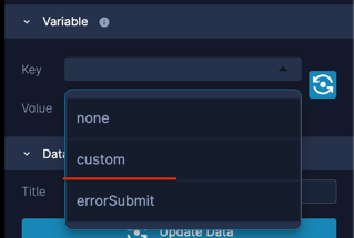
Variable
Every component requires its unique variable to ensure accurate data storage.
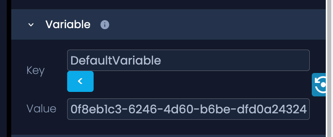
When initially adding components, a DefaultVariable is assigned. To modify this variable, click on the "Key," triggering a dropdown menu with alternative options. Opt for "custom" to create and assign your specific variable.
Config
A configuration (config) is a flexible object that allows us to store arbitrary data as key-value pairs whenever necessary. These pairs are defined based on specific needs and requirements.

Render expression
Within Render expressions, you have the capability to articulate specific conditions that define the behavior or appearance of the component.

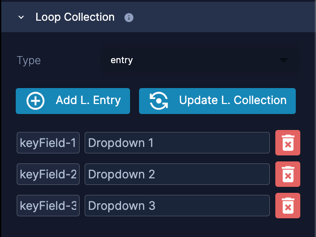
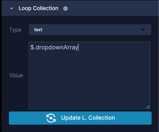
Loop collection
In the Loop Collection, you have the option to choose the type for displaying dropdown values:
- Text: Allows you to set dropdown values using an array. Example: use $.dropdownArray to get the dropdown values from the context.
- Entry: Enables the configuration of static dropdown values.
Remember to click the "Update Loop Collection" button after adding values to ensure they are saved.
Node Configuration Tab
Within Node configuration, you encounter two essential components: Variables and Configurations.
Variables
Within Node configuration, you can add new variables or modify existing ones, each with specific attributes:
- Required: When marked, the variable becomes mandatory, and the node won't execute if it remains empty.
- Main Key: Designates the variable as the main key, where its values should correspond to the next node's number.
- Name: The variable's identifier, which can be customized to any desired name.
- Title: Represents the component's title.
- Default Value: Allows setting a default value for the variable.
- Validations: Supports various validations, such as email or alphanumeric checks, enhancing data integrity.
At least one variable should be the Main key.
Config
A configuration (config) is a flexible object that allows us to store arbitrary data as key-value pairs whenever necessary. These pairs are defined based on specific needs and requirements.
