Image component
The Image Component is a graphical element that displays visual content, typically pictures or illustrations, within a user interface. It allows to integrate images into the applications, enhancing the visual appeal and conveying information through graphics.
Component Styles tab
Image and other components share the same styling options, allowing you to apply various styles to customize their appearance. Explore more about styling by clicking here.
Component Configuration tab
Within Component Configuration, adjustments specific to the component can be made, offering the flexibility to modify various variables tailored to your needs.
Please, make sure to click on the Update button when you make changes and save it in the Component config. Otherwise, data will not be saved.
Name
The Name is the title of the component.

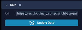
Data
Modifying the URL in the Data will be reflected in the user interface (UI).
Config
A configuration (config) is a flexible object that allows us to store arbitrary data as key-value pairs whenever necessary. These pairs are defined based on specific needs and requirements.

Render expression
Within Render expressions, you have the capability to articulate specific conditions that define the behavior or appearance of the component.
